STOCK MARKET
during
COVID-19 in 2021

Created by Bry

COVID-19 CASES & S&P 500 CLOSING PRICE

The scatter plot displays the total number of COVID-19 cases in the U.S. per millions on the y-axis and the S&P 500 closing price on the x-axis. The S&P 500 index was used to measure the U.S. stock market performance since it measures the stock performance of 500 large companies listed on various stock exchanges in the United States. The stock market index provides us with a general sense of how the entire market is performing. It is apparent there is a higher closing price for the S&P 500 when there are more cases. Intuitively, this is a confusing result as we would assume greater COVID-19 cases would lead to state closures/lockdowns which would lower overall consumption from the lack of disposable income. This would in turn lead to a lower S&P 500 closing price. However, the scatter plot says otherwise. One possible explanation for the positive correlation between COVID-19 cases and U.S. stock market performance is the inclusion of stimulus checks and their effect on the overall economy. Data used to generate the scatter plot was from the dates 01/04/21 to 03/08/21 giving us a short-run view of the relationship between stock performance and cases.

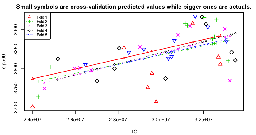
Cross Validation Chart

linear regression model

Cross-validation chart using S&P 500 closing price as dependent variable and COVID-19 cases as the independent variable. X-axis is total COVID-19 cases in the millions while the Y-axis is S&P 500 closing price.

Background on Cross-validation chart

The above cross-validation chart may be confusing to individuals who have never heard of the cross-validation method. To provide some clarification, we need to understand how the chart came to be. Initially, the visualization in the middle was going to be a regression model. I created a regression model using R where I regressed the S&P 500 closing price on Total COVID-19 cases. This was the regression: S&P500 = 3.446e+03 + 1.314e-05 x Total COVID-19 cases. Before we dive any further, I also calculated the correlation between S&P 500 and total COVID-19 cases and found a positive correlation of 0.5978508. In an attempt to understand the relationship even further, I obtained summary statistics on the linear regression model. I found the p-values for the coefficients to be statistically significant at the 0-0.001 level. The p-value for the intercept and total COVID-19 cases were 2e-16 and 1.82e-05 respectively. In other words, the linear regression model is statistically significant. Some additional notable findings were as follows: Residual standard error: 50.88 on 42 degrees of freedom; Adjusted R-squared: 0.3421; F-statistic: 23.36; Now, onto the fun. When I created the linear regression model I used the entire dataset. This prevented me from visualizing how the model would react to new data. Thus, I split the dataset in an 80:20 sample. Created the model using only 80% sample to predict the dependent variable on test data. This allowed me to have model predicted values for the 20% data in addition to the actual values from the original dataset. Finally, to ensure that the created model performs well when it is built on different training data and predicted on the remaining data, I split the data into 'k' mutually exclusive random sample portions. In this instance, k=5 as there are 5 folds. I set each portion as test data and built the model on the remaining data while calculating the mean squared error of the predictions. I then computed the average of these mean squared errors to compare the different linear models. In summation, what the cross-validation chart displays is differnt model predictions which allows for the comparison of model's prediction accuracy and the comparison of the lines of best fit.

S&P 500 CLOSING PRICE & COVID-19 CASES

The connected scatter plot resembles the original scatter plot. However, I have transposed the x and y axis as this visualization displayed the data more appropriately. Now the total cases per day are on the x-axis and the S&P 500 closing price is on the y-axis. Given the increasing nature of COVID-19 cases, the x-axis can be interpreted as a linear progression of the month since the data used also showed COVID-19 cases increasing per day. The visualization emphasizes certain characteristics of the data. First, greater COVID-19 cases are positively correlated with greater S&P 500 index closing prices. Interestingly, the highest S&P 500 closing price did not occur when COVID-19 cases were at an all time high. According to the data used, S&P 500 index had the highest closing price when COVID-19 cases were around 31 - 32 million. After 32 million COVID-19 cases, it appears the S&P 500 closing price begins to trend downward. There are too many factors that could affect the S&P500 index closing price. There also appears to be a fluctuation in the closing price throughout the month. This can be attributed to many factors including but not limited to the cyclical expansions and contractions of the economy. Perhaps the effect of COVID-19 cases on stock market performance is too insignificant to disrupt the continuous growth of the bull market. Robinhood and Webull may also explain the unwavering growth in the stock market.

IMPORTANT STATISTICS

Current U.S. Covid-19 cases as of 3/08/21
Current deaths due to Covid-19 as of 3/08/21
S&P 500 closing price as of 3/08/21
Fully vaccinated individuals as of 3/08/21